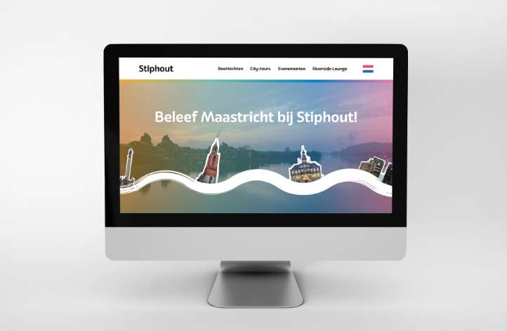
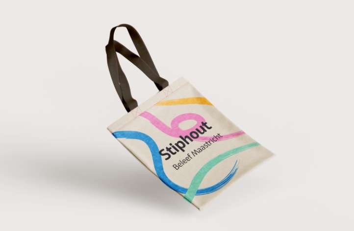
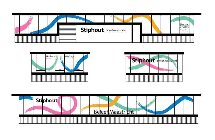
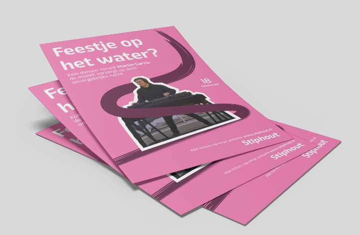
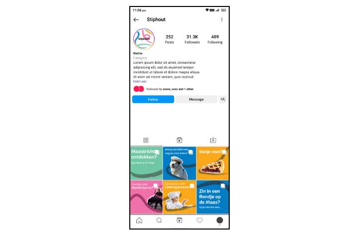
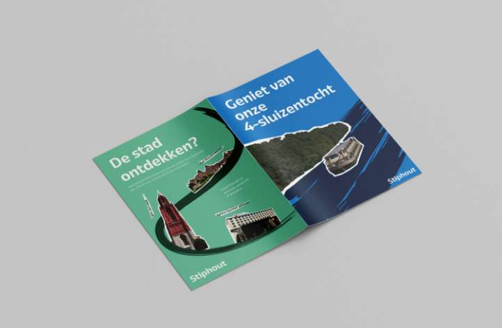
This is a rebrand concept for a boat tour company in Maastricht. Their current branding doesn’t connect with their desired user base and lacks certain basic design. Stiphout consists of four branches, which is why I picked four distinct colours. This way I can easily separate the branches visually, whilst keeping the rest of the branding consistent. The goal of the rebrand was to convey what kind of experience people could get when booking a tour with Stiphout.